OVERVIEW
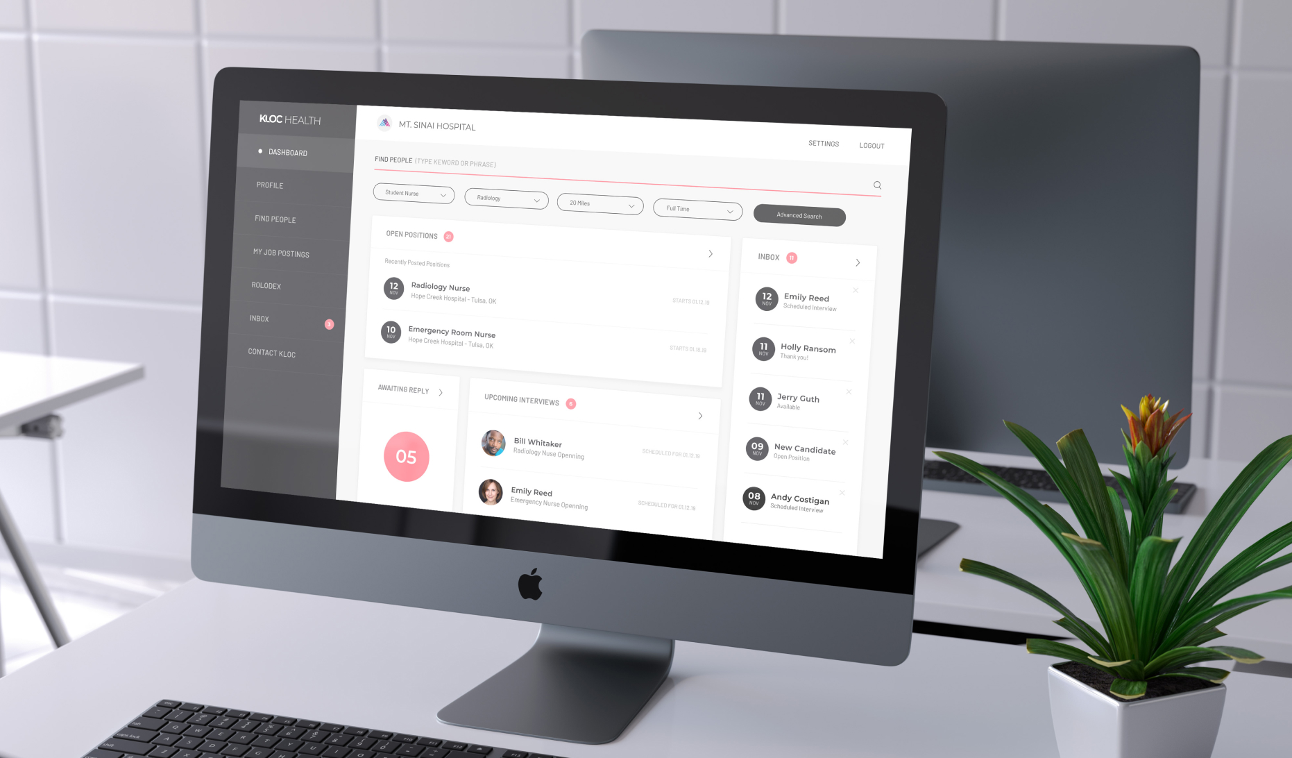
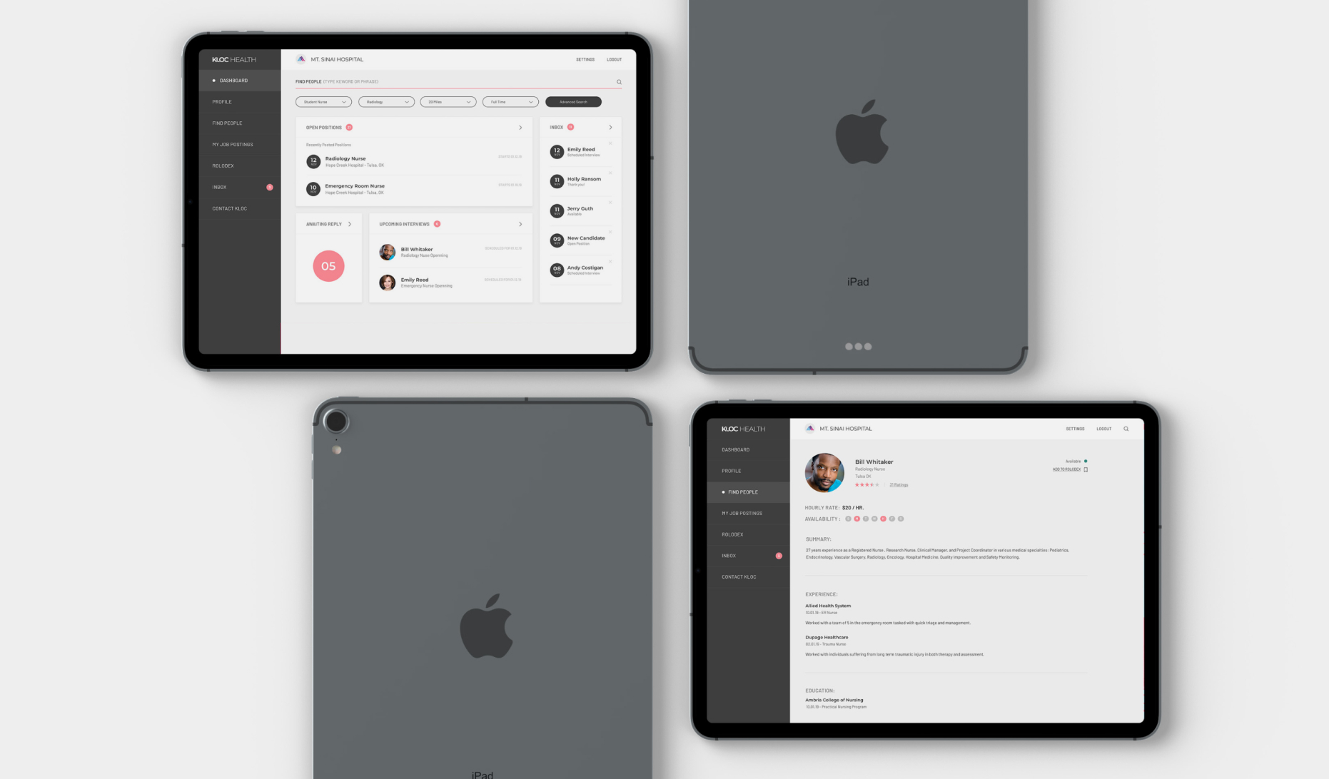
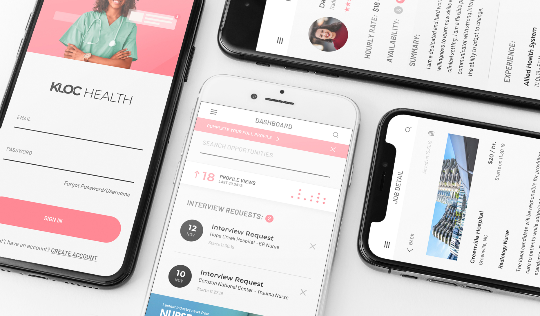
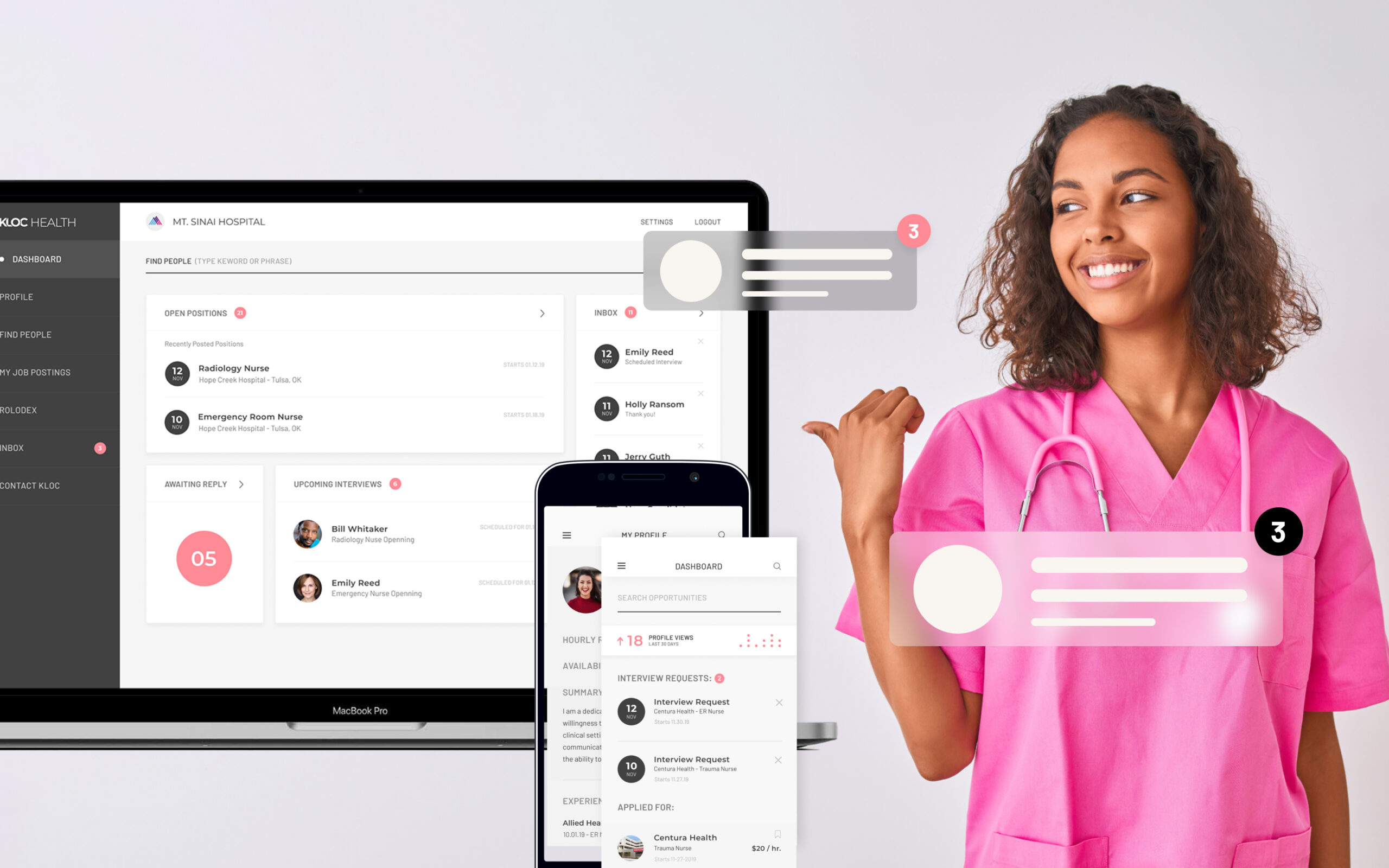
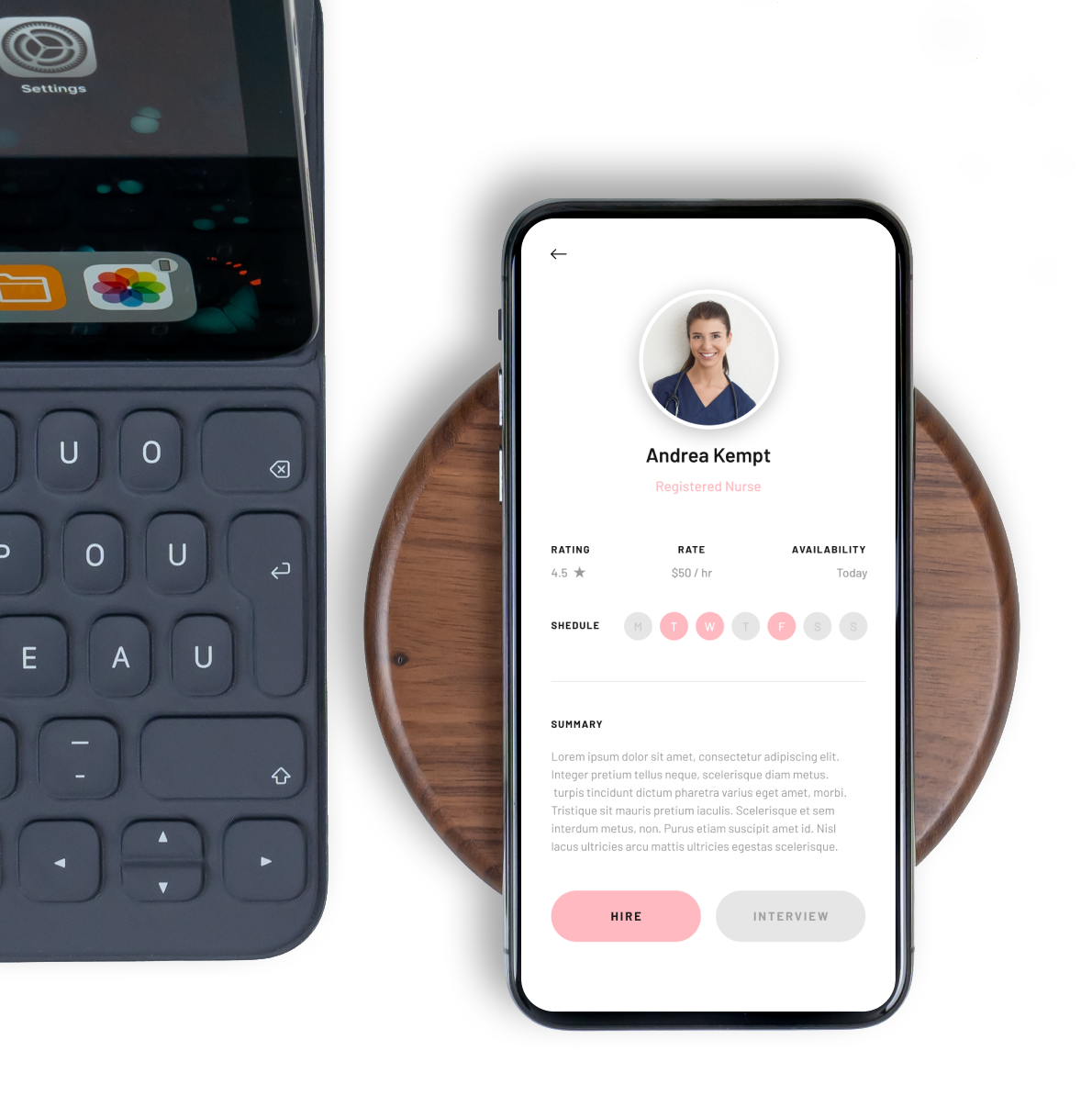
KLOC asked us to develop a logo and brand for their MVP, a desktop dashboard where hospitals can search against availability, location, skill-sets and personality to secure the right nurse for the right job, and a mobile web app where nurses can create a professional profile, set their rate and availability and apply for open positions.
MY ROLE
UX Design • UI Design • Brand Development
TEAMMATES
Christopher D’Antonio (UX, UI, Brand), Andrew Martin (Front-end, Back-end development)
DURATION
6 weeks (Brand, Landing Page), 16 weeks (MVP prototype)
Research and Discovery
Our first step was to delve into all the research the team has conducted in order to gather insights into our customer and their goals, as well as solve the largest pain points across our two primary user segments.
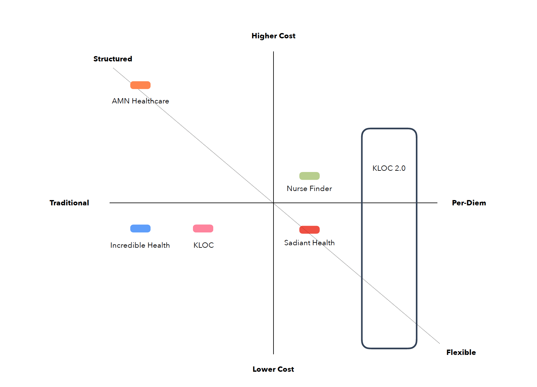
We looked at some of the biggest players in the industry to get a feel of the competition, objectively judge their performance, and use that information to our strategic benefit and positioning.
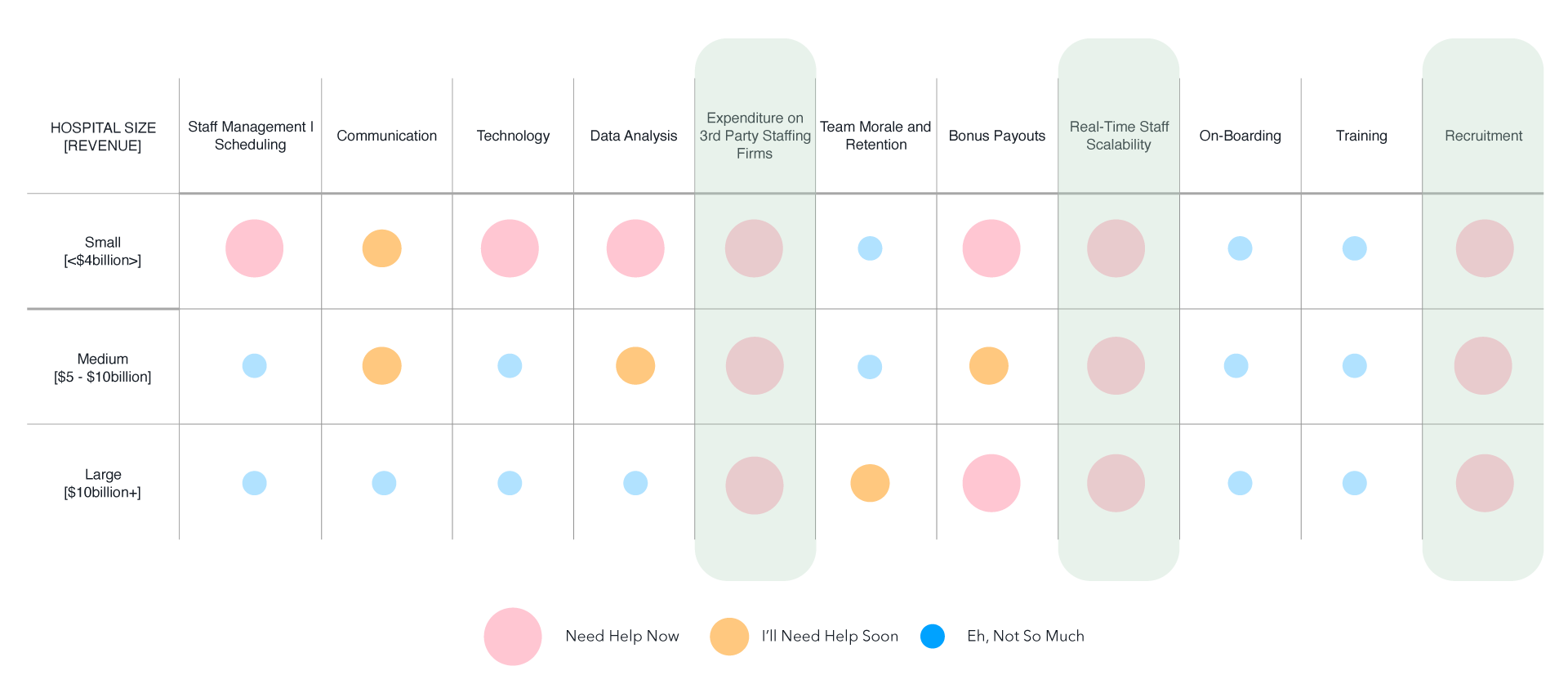
We talked to hiring managers and execs at hospitals of of varying sizes to figure out which problems needed to be solved immediately vs later down the road.
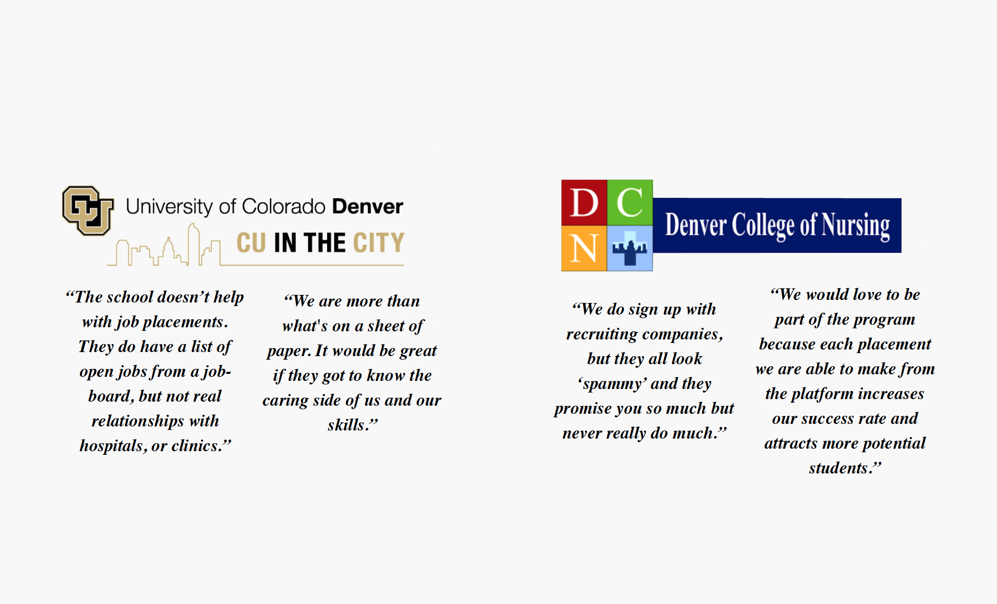
And finally, we asked the nurses about their experience with staffing agencies because we wanted to hear the issues directly from the user base.
Pain Points
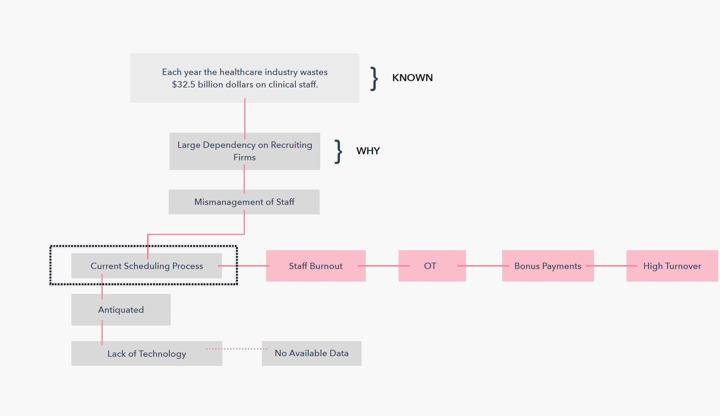
- Average number of days to replace a RN: 81
- Average annual hospital loss due to staff turnover and mismanagement: $5.7mm
- Hospitals looking to reduce dependency on staffing agencies: 52%
- US healthcare temporary staffing revenue in 2017 generated: $11.3 BIL
Solutions
- Reduce hospital staffing spend so that hospitals can take those cost savings to improve health outcomes for all.
- Empower 2.5% of the 6,200 hospitals in the United States to lower their annual hospital staffing costs by at least 40% ($2.2 MIL) by the year 2024.
- We see the potential for KLOC to become a global SaaS solution.

Logo and Branding
For the brand, we needed to appeal to a largely female audience of nurse practitioners while still remaining professional for the hospital execs, so we took a clean and elegant approach with a strong typeface and a softer color palette. Below are some brand attributes we wanted the brand communicate:
- Simple
- Approachable
- Helpful
- Committed
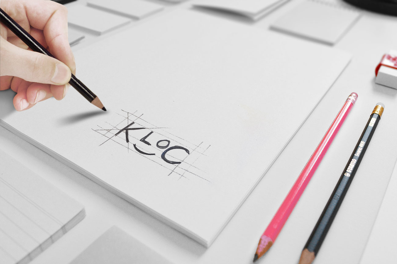
Logo Exploration

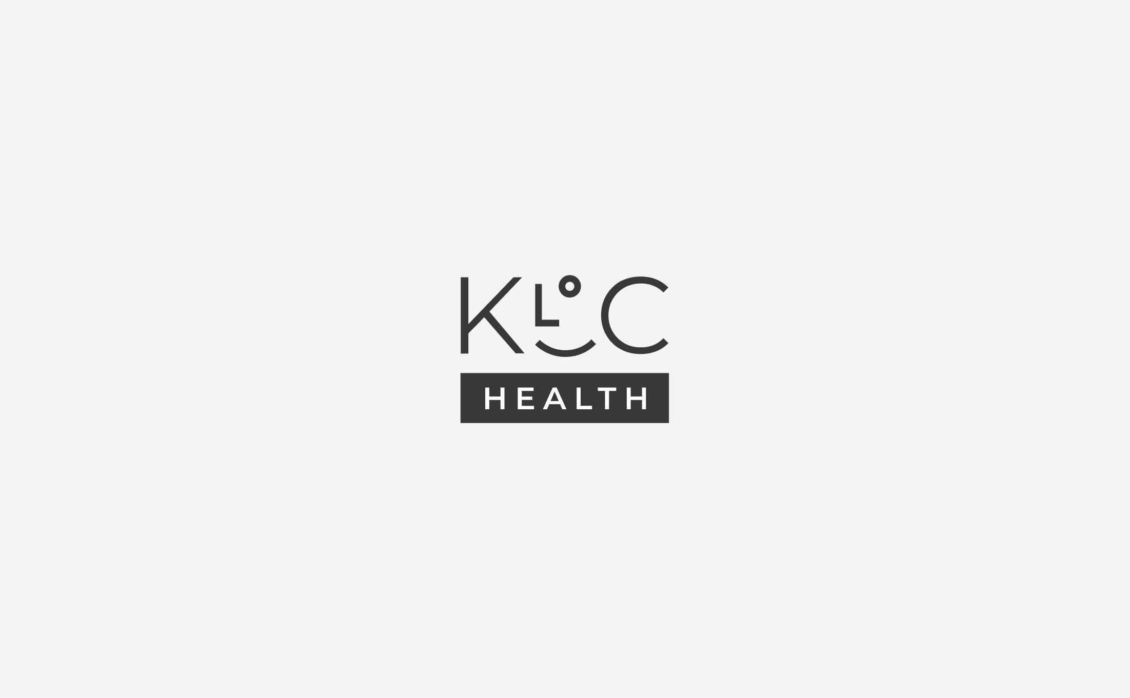
Our Favorite
Final Client Pick
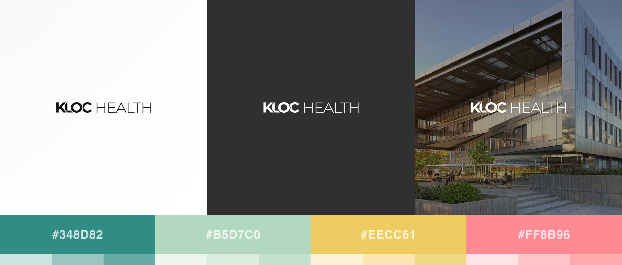
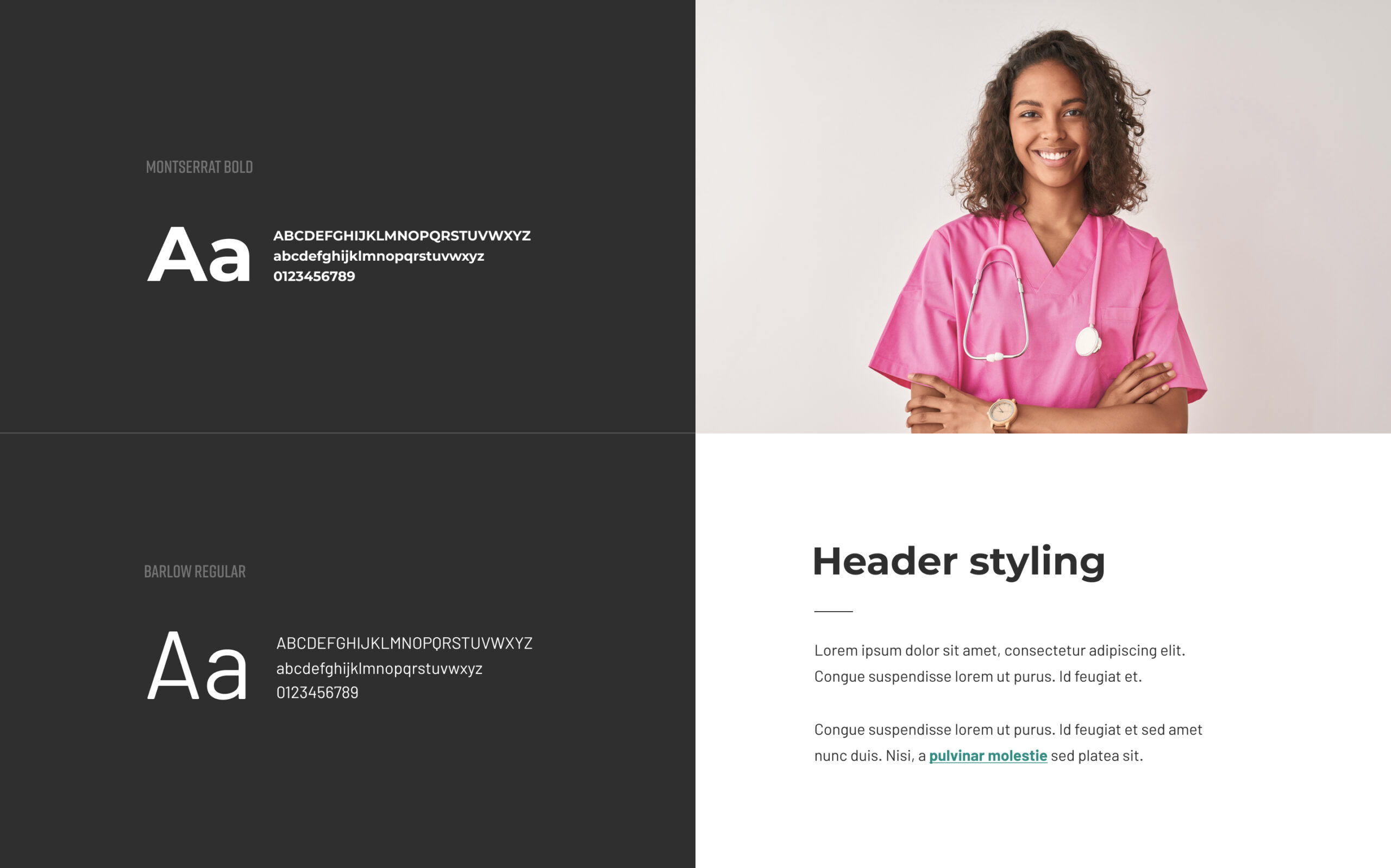
Illustration Set


UX and Wireframing
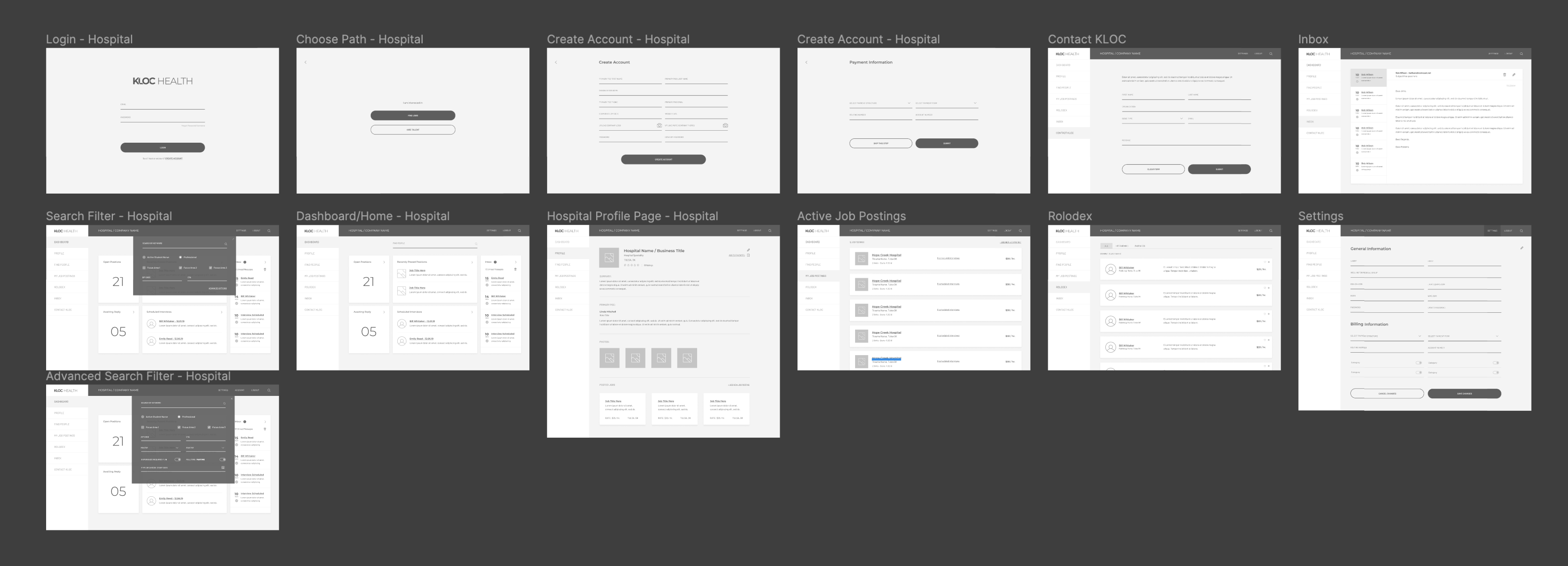
It was important to start with a low-fidelity wireframes to validate the main features, visual hierarchy and flow without worrying about content or branding.


Design and Prototype
Once the primary experience was approved in wireframes, we started applying the branding and designing the the UI elements.
